React Aria Components - Slider with filled background
Even though I’ve been an Engineering Manager for the past two years, I still love getting my hands dirty with code! Recently, I helped my team with a cool UI challenge - customizing React Aria’s Slider component to show a filled background between two thumbs.
Before & After
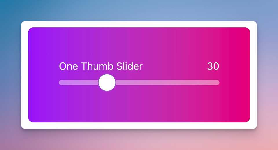
Let’s see how the slider looks with and without the fill effect:
Slider without filled background
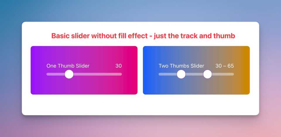 Basic slider without fill effect - just the track and thumb
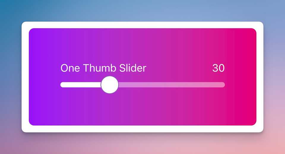
Slider with filled background
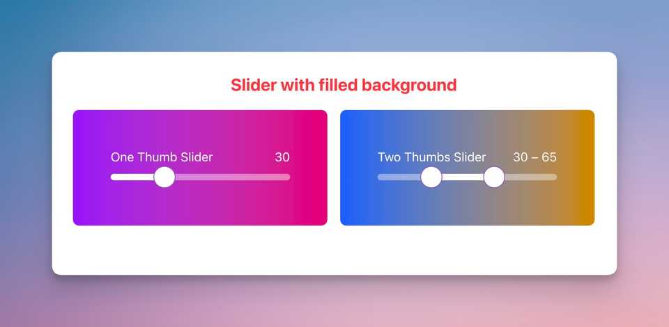 Enhanced slider with fill effect - notice the white background
Source Code & Demo
The Challenge
React Aria’s Slider component is awesome for accessibility, but it doesn’t come with a built-in way to show the filled portion of the slider. When you have a range slider (two thumbs), you might want to visually indicate the selected range with a filled background.
The Solution
One thumb slider
First, let’s look at a basic single-thumb slider:
import {Label, Slider, SliderOutput, SliderThumb, SliderTrack} from 'react-aria-components';

<Slider defaultValue={30}>
  <Label>Basic Slider</Label>
  <SliderOutput />
  <SliderTrack>
    <SliderThumb />
  </SliderTrack>
</Slider>
⚠️ Important: The above code will only render a label and a circle without any styling. You’ll need to add CSS to make it look good.
Since our project uses Tailwind CSS, here’s our styled version:
import {
  Label,
  Slider,
  SliderOutput,
  SliderThumb,
  SliderTrack,
} from 'react-aria-components';

export function OneThumbSlider() {
  return (
    <div className="bg-linear-to-r from-purple-600 to-pink-600 p-12 rounded-lg flex justify-center">
      <Slider defaultValue={30} className="w-[250px]">
        <div className="flex text-white">
          <Label className="flex-1 text-left">Basic Slider</Label>
          <SliderOutput />
        </div>
        <SliderTrack className="relative w-full h-7">
          {() => (
            <>
              <div className="absolute h-2 top-[50%] translate-y-[-50%] w-full rounded-full bg-white/40" />
              <SliderThumb className="h-7 w-7 top-[50%] rounded-full border border-solid border-purple-800/75 bg-white transition dragging:bg-purple-100 outline-hidden focus-visible:ring-2 ring-black" />
            </>
          )}
        </SliderTrack>
      </Slider>
    </div>
  );
}
Here’s how it looks:
This implementation is based on the React Aria Opacity Slider example from Adobe’s React Spectrum documentation.
Now, let’s add the filled background. We’ll create a new prop to toggle this feature:
+ interface OneThumbSliderProps {
+   fill: boolean;
+ }

export function OneThumbSlider({ fill }: OneThumbSliderProps) {
  return (
    <div className="bg-linear-to-r from-purple-600 to-pink-600 p-12 rounded-lg flex justify-center">
      <Slider defaultValue={30} className="w-[250px]">
        <div className="flex text-white">
          <Label className="flex-1 text-left">Basic Slider</Label>
          <SliderOutput />
        </div>
        <SliderTrack className="relative w-full h-7">
          {({ state }) => (
            <>
              <div className="absolute h-2 top-[50%] translate-y-[-50%] w-full rounded-full bg-white/40" />
+              {fill && (
+                <div
+                  className="absolute h-2 top-[50%] translate-y-[-50%] rounded-full bg-white"
+                  style={{ width: state.getThumbPercent(0) * 100 + '%' }}
+                />
+              )}
              <SliderThumb className="h-7 w-7 top-[50%] rounded-full border border-solid border-purple-800/75 bg-white transition dragging:bg-purple-100 outline-hidden focus-visible:ring-2 ring-black" />
            </>
          )}
        </SliderTrack>
      </Slider>
    </div>
  );
}
Let’s break down the key parts:
-
The CSS classes
absolute h-2 top-[50%] translate-y-[-50%] rounded-full bg-white: Positions and styles the fill element - absolute positioning, 8px height, using vertically centered trick of translate-y-[50%], rounded corners, and white background -
The width calculation:
state.getThumbPercent(0)returns the position of the first thumb as a decimal (0 to 1)* 100converts the decimal to a percentage- This creates a dynamic width that matches the thumb’s position
For example, if the slider value is 30 (out of 100):
state.getThumbPercent(0)returns 0.3 (30%)0.3 * 100= 3030 + '%'= “30%”- So the fill div will be 30% of the track’s width
And here’s the result:
Two thumbs slider
For a range slider with two thumbs, we need to:
- Pass an array of two values as
defaultValue - Map through the values to render multiple thumbs and format the output
Here’s how we implement it:
export function TwoThumbsSlider({ fill }: TwoThumbsSliderProps) {
  return (
    <div className="bg-linear-to-r from-blue-600 to-yellow-600 p-12 rounded-lg flex justify-center">
+      <Slider defaultValue={[30, 65]} className="w-[250px]">
        <div className="flex text-white">
          <Label className="flex-1 text-left">Two Thumbs Slider</Label>
+          <SliderOutput>
+            {({ state }) =>
+              state.values
+                .map((_, i) => state.getThumbValueLabel(i))
+                .join(' – ')
+            }
+          </SliderOutput>
        </div>
        <SliderTrack className="relative w-full h-7">
          {({ state }) => (
            <>
              <div className="absolute h-2 top-[50%] translate-y-[-50%] w-full rounded-full bg-white/40" />
              {fill && (
                <div
                  className="absolute h-2 top-[50%] translate-y-[-50%] rounded-full bg-white"
                  style={getSliderFillStyles(state)}
                />
              )}
+              {state.values.map((_, i) => (
+                <SliderThumb
+                  className="h-7 w-7 top-[50%] rounded-full border border-solid border-purple-800/75 bg-white transition
+                    dragging:bg-purple-100 outline-hidden focus-visible:ring-2 ring-black"
+                  key={i}
+                  index={i}
+                />
+              ))}
            </>
          )}
        </SliderTrack>
      </Slider>
    </div>
  );
}
Key differences from the single thumb slider:
defaultValueis now an array[30, 65]for two thumbsSliderOutputusesmapto show both values joined with a dashSliderThumbis rendered usingmapwith anindexprop- The fill background uses
getSliderFillStylesto calculate width and position between thumbs
Here’s the magic function that handles the fill styles for both single and double thumbs:
function getSliderFillStyles(state: SliderState) {
  if (state.values.length === 1) {
    return {
      width: state.getThumbPercent(0) * 100 + '%',
      left: '0%',
    };
  }

  return {
    width: (state.getThumbPercent(1) - state.getThumbPercent(0)) * 100 + '%',
    left: state.getThumbPercent(0) * 100 + '%',
  };
}
Let’s break down how it works with our example values [30, 65]:
- For two thumbs, it calculates:
width:(0.65 - 0.30) * 100 = 35%(fills 35% of the track)left:0.30 * 100 = 30%(starts at 30% from the left)
- This creates a fill that spans exactly between the two thumbs
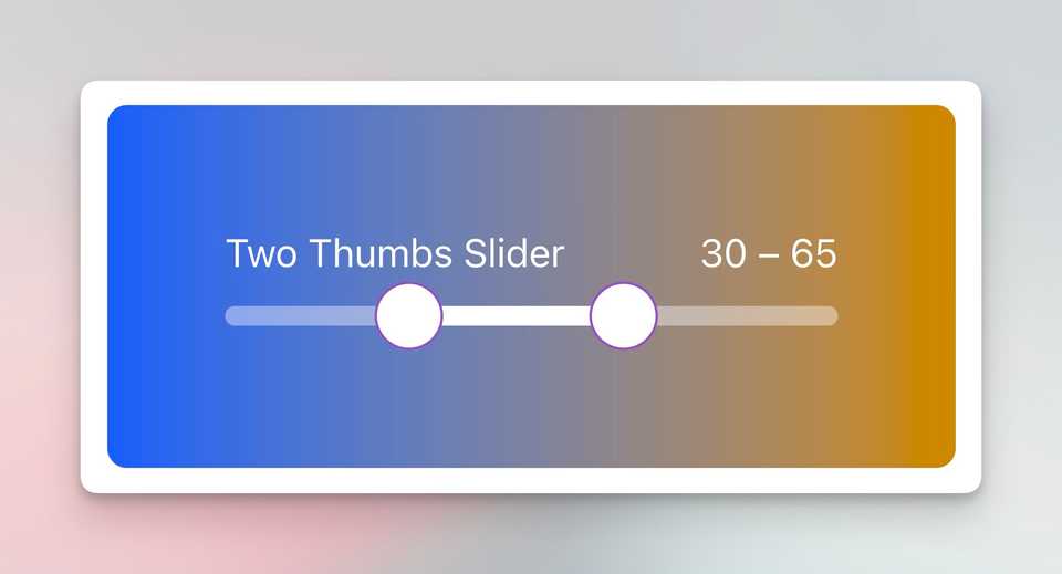
And here’s the result:
💡 Note: In this demo, I’ve separated the single and double thumb sliders into different components (
OneThumbSliderandTwoThumbsSlider) to make the differences clearer. In a real application, you can use a single slider component that handles both cases - just pass either a single value or an array of two values todefaultValue.
Why This Matters
As an Engineering Manager, I believe in leading by example and helping my team solve technical challenges. This kind of UI enhancement might seem small, but it makes a big difference in user experience. Plus, it’s a great way to stay connected with the technical side of things while supporting my team’s growth!
