Common use cases and solutions for accessibility in Angular
⚠️ This is a work in progress article.
At Ascenda, we built a suite of products that bring effortless rewards technology for financial services. One critical requirement is making the application accessible to all users. This blog will document the everyday use cases and solutions for accessibility in Angular that I have encountered along the way.
What is accessibility?
Broadly speaking, when we say a site is accessible, we mean that the site’s content is available, and its functionality can be operated, by literally
anyone.
While working with accessibility or a11y in short, you will hear a lot about Web Content Accessibility Guidelines (WCAG), a set of guidelines that define how to make web content accessible. However, WCAG can also be a bit overwhelming. To help mitigate this, the WebAIM (Web Accessibility in Mind) group has distilled the WCAG guidelines into an easy-to-follow checklist, targeted specifically for web content.
The WebAIM checklist can give you a short, high-level summary of what you need to implement, while also linking to the underlying WCAG specification if you need an expanded definition.
Compliances Levels
At Ascenda’s core fintech platform, many stakeholders are involved in making the application accessible, including product people, developers, designers, and QA engineers. For some of you that don’t know, the WCAG guidelines are classified into three conformance levels. We followed WCAG 2.1 Level A and AA criteria.
- Level A - Considered the least strict, Level A success criteria are essential for every website. If your website doesn’t conform with WCAG Level A, it may have serious accessibility issues that prevent users with disabilities from using it.
- Level AA - Websites that conform with WCAG Level AA can be considered reasonably accessible for most users.
Most websitesshould aim for Level AA conformance. To meet this goal, content must conform with all Level AA and Level A success criteria. - Level AAA - Digital content that conforms with WCAG Level AAA is considered optimally accessible. To earn Level AAA conformance, content must pass every guideline in WCAG (including Level AA and Level A success criteria). However, some Level AAA success criteria are extremely strict, and some types of content cannot conform with every guideline at this level.
Our WCAG Ascenda Guideline has been rewritten to help understand WHAT is each criterion and HOW we could meet its requirements easier for all of the stakeholders. Following is an example of how it has been simplify for our team, hope you get the idea. I omit the section where we map each criterion to our product.
| Criterion | Level | Type | Description |
|---|---|---|---|
| 1.1.1 Non-text Content | A | Tech & Design | Provide alt-text for non-text content (Except for 1. decorative image 2. visual formatting 3. invisible elements) |
| 1.3.1 Info and Relationships | A | Tech | Header, title and subtitle have various heading levels according to the content structure; For all pages, there is one and only one heading level 1 item. |
| 1.4.1 Use of Color | A | Design | Don’t use presentation that relies solely on colour. This requirement is color specific while the 1.3.3. covers all other visual elements. |
| 1.3.5 Identify Input Purpose | AA | Tech | Form fields can be recognized and auto-filled by browser. |
And lot of more.
Testing Tools
We start with the following tools for testing
- Keyboard
- Screen reader
- Page Magnifier
Keyboard
Keyboard accessibility is one of the most important aspects of web accessibility. Potential problems:
- Focus indicator: a sighted keyboard user must be provided with a visual indicator of the element that currently has keyboard focus.
- Navigation order
- Items that cannot receive keyboard focus
- Inaccessible custom widgets: complex menu, sliders, dialog, tab panel, etc. must all be built to support keyboard a11y.
- Length navigation: tabbing through length navigation maybe particularly demanding for users with motor disabilities.
Screen Reader
A “screen reader” is a software application that convert the text displayed on a computer screen into synthesized speech. Potential problems:
- Elements does not have correct alt
- Language of the page cannot be determined
- Incorrect text pronunciation of foreign language
VoiceOver
VoiceOver is a screen reader that is available for Mac and iOS. It is a free software application that can be used to read aloud text on a screen.
1️⃣ How to start VoiceOver?
Command+F5Command+ press touch ID three timesSystem Preferences>Accessibility>VoiceOverand selectingEnable VoiceOver.
The VoiceOver Activation keys (called VO keys) are control + option. These keys are used to access special VoiceOver commands and functions and will be referenced simply as VO.
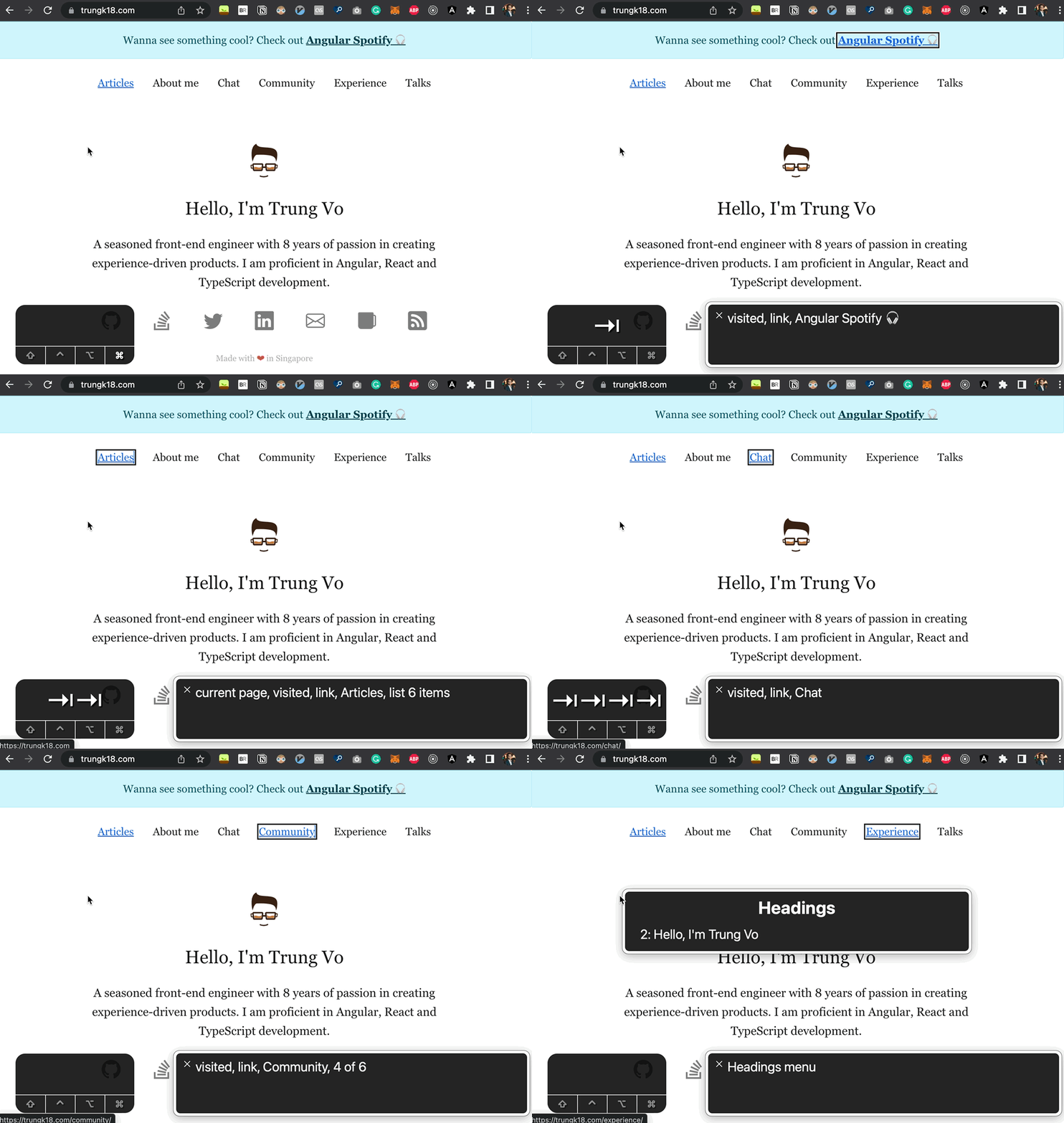
2️⃣ Basic useful commands
VO+A: Start readingcontrol: Stop ReadingVO+→: Read next itemVO+←: Read previous itemVO+U: Navigate by various items such as Heading.
View full commands
3️⃣ Example

Common Use Cases
1. Visually break line, but Voiceover need to speak as one line
❌ Problem
Usually, you’ll have to use <br> tag to break line on the HTML code to make a new line. Why? The design will look nicely with two lines, why not? But if you need to do it for a heading, the Voiceover won’t be able to read it as one line. See the screenshot below for an example.
If I have this HTML
@Component({
  selector: 'break-line',
  template: `
    <h2>This is a great introduction <br /> and I need to be displayed in two lines</h2>
  `,
})
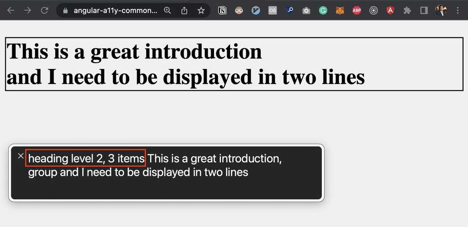
That’s how screen reader will read it:
You see it right, suddenly there is additional 3 items in the heading because we have <br> tag that break the sentence into two parts + the br itself.
✅ How to to fix it?
Instead of using br, you can:
- Use the new line character
\nandinnerHTMLfor rendering. - Apply
white-space: pre-line
@Component({
  selector: 'break-line',
  template: `
    <h2 [innerHTML]="'This is a great introduction \n and I need to be displayed in two lines'"></h2>
  `,
  styles: [
    `
      h2 {
        white-space: pre-line;
      }
    `,
  ],
})
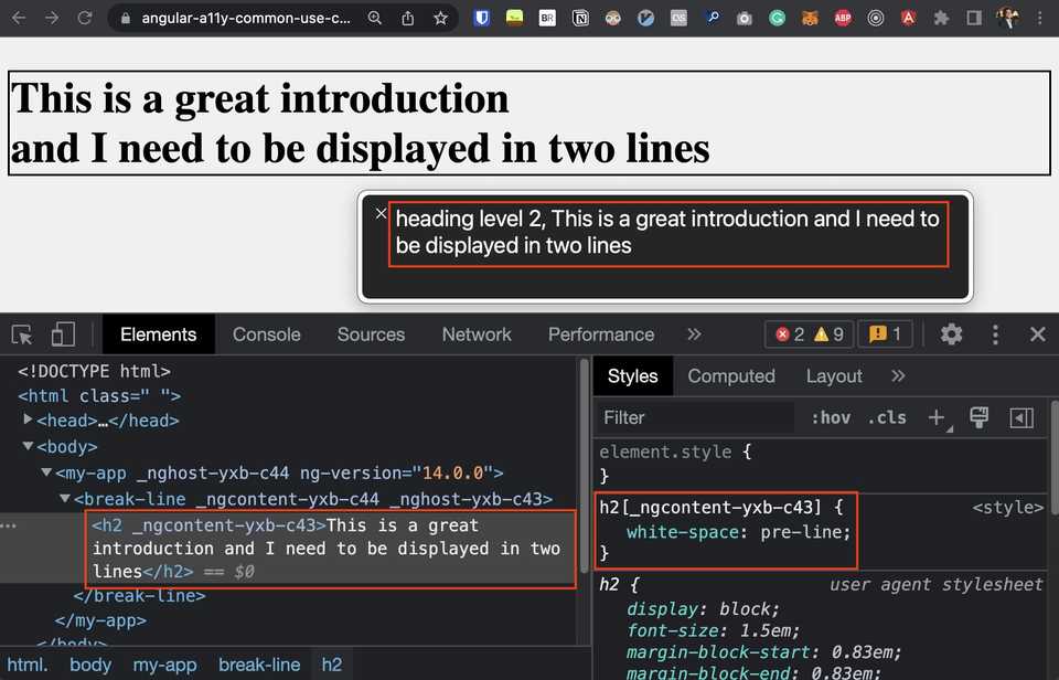
That’s result, no more the annoying 3 items in the heading!
Source code
Resources
The following articles/blogs/websites are resources for learning about accessibility in Angular that I went through. Hope you find them useful!

