Angular Jira Clone Part 06 - Build a markdown text editor
If you notice, the current jira.trungk18.com is using an HTML text editor. I am working on making a Markdown text editor for phase two, and I think it is a good start to share with you. Part seven will guide you through an HTML text editor using ngx-quill.
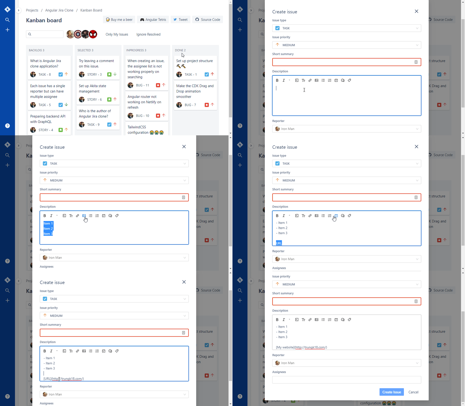
That’s how a Markdown text editor looks.
See all tutorials for Jira clone
Source code and demo
Markdown Editor Module
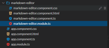
A markdown text editor might be reused in many places on a web application, so that I will create a brand new module MarkdownEditorModule for that purpose. At the moment, it will have only one component, MarkdownEditorComponent, and it will be exported as well.
There is not much code inside its module and component.
markdown-editor.component.ts
@Component({
  selector: 'markdown-editor',
  templateUrl: './markdown-editor.component.html',
  styleUrls: ['./markdown-editor.component.css'],
})
export class MarkdownEditorComponent implements OnInit {
  ngOnInit() {}
}
markdown-editor.module.ts
@NgModule({
  imports: [CommonModule],
  exports: [MarkdownEditorComponent],
  declarations: [MarkdownEditorComponent],
})
export class MarkdownEditorModule {}
No worry, we will add more code below.
Github Markdown Toolbar
Install @github/markdown-toolbar-element and use it inside our Angular component
@nartc suggested me to use that package to enable a markdown toolbar. I had a look and really like that tiny package, plus It came from Github itself. 😊
To add that to an Angular application, simply run.
npm install --save @github/markdown-toolbar-elementSecond, you need to import @github/markdown-toolbar-element into MarkdownEditorComponent.
import '@github/markdown-toolbar-element'Then you can paste the below code into MarkdownEditorComponent.
markdown-editor.component.html
<markdown-toolbar for="textarea_id">
  <md-bold>bold</md-bold>
  <md-header>header</md-header>
  <md-italic>italic</md-italic>
  <md-quote>quote</md-quote>
  <md-code>code</md-code>
  <md-link>link</md-link>
  <md-image>image</md-image>
  <md-unordered-list>unordered-list</md-unordered-list>
  <md-ordered-list>ordered-list</md-ordered-list>
  <md-task-list>task-list</md-task-list>
  <md-mention>mention</md-mention>
  <md-ref>ref</md-ref>
</markdown-toolbar>
<textarea id="textarea_id"></textarea>
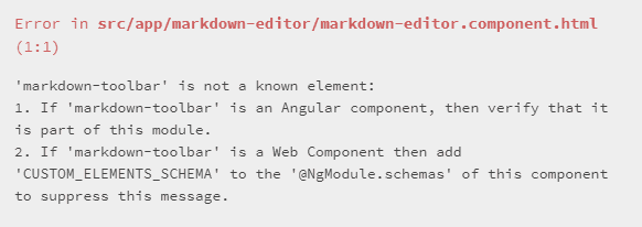
Because markdown-toolbar is a custom web element tag and it looks like an Angular component selector. Angular couldn’t find the declaration elsewhere. That’s why you see that error.
To fix it, follow the error on the screen to add CUSTOM_ELEMENTS_SCHEMA into the MarkdownEditorModule
@NgModule({
  //code removed for brevity
  schemas: [CUSTOM_ELEMENTS_SCHEMA]
})
Now, something is rendering on the UI, and the textarea gets updated upon selection on the toolbar, but it hasn’t looked good just yet.

Styling the markdown toolbar
To make styling easier, I set a button with class .btn and wrap the text into a button. I also use Boostrap Icon to make it look like a real toolbar. markdown-editor.component.html is getting pretty long because all of the icons are SVG. I won’t paste all of them here. Take a look at one bold icon, and you will understand.
<markdown-toolbar for="textarea_id">
  <md-bold>
    <button class="btn">
    <svg width="1em"
          height="1em"
          viewBox="0 0 16 16"
          class="bi bi-type-bold"
          fill="currentColor"
          xmlns="http://www.w3.org/2000/svg">
        <path d="M8.21 13c2.106 0 3.412-1.087 3.412-2.823 0-1.306-.984-2.283-2.324-2.386v-.055a2.176 2.176 0 0 0 1.852-2.14c0-1.51-1.162-2.46-3.014-2.46H3.843V13H8.21zM5.908 4.674h1.696c.963 0 1.517.451 1.517 1.244 0 .834-.629 1.32-1.73 1.32H5.908V4.673zm0 6.788V8.598h1.73c1.217 0 1.88.492 1.88 1.415 0 .943-.643 1.449-1.832 1.449H5.907z" />
    </svg></button>
  </md-bold>
  <!-- code removed for brevity -->
</markdown-toolbar>$hover-color: #06c;
markdown-toolbar {
padding: 8px;
.btn {
background: none;
border: none;
cursor: pointer;
display: inline-block;
height: 24px;
padding: 3px 5px;
width: 28px;
color: #222;
i {
display: flex;
}
&:hover {
color: $hover-color;
}
}
}
After styling the textarea as below, you will see quite a satisfying result. 😊
Styling the textarea
I will do the styling for the textarea as well.
First, I assign a class text-editor to that textarea.
<textarea id="textarea_id"
          class="text-editor">
</textarea>
For the CSS, I wanted:
- No border for textarea
- Have border for the container around the markdown toolbar and textarea
- On hovering the textarea, set a different border color for the container
I hope my CSS will express itself :) But if you have any questions about CSS, let me know in the comment box below.
$border-color: #d9d9d9;

:host {
  border: 1px solid $border-color;
  box-shadow: 0 0 0 1px $border-color;
  border-radius: 3px;
  outline: none;
  background: #fff;
  display: flex;
  flex-direction: column;

  .text-editor {
    padding-left: 15px;
    padding-right: 15px;
    resize: none;
    border-color: transparent;
    width: 100%;
    overflow-y: hidden;

    &:focus {
      outline: none;
      border: transparent;
    }
  }

  &.focus {
    border: 1px solid $hover-color;
    box-shadow: 0 0 0 1px $hover-color;
  }
}
I have a result now. Looks pretty good. But the border-color didn’t change when I select the textarea.
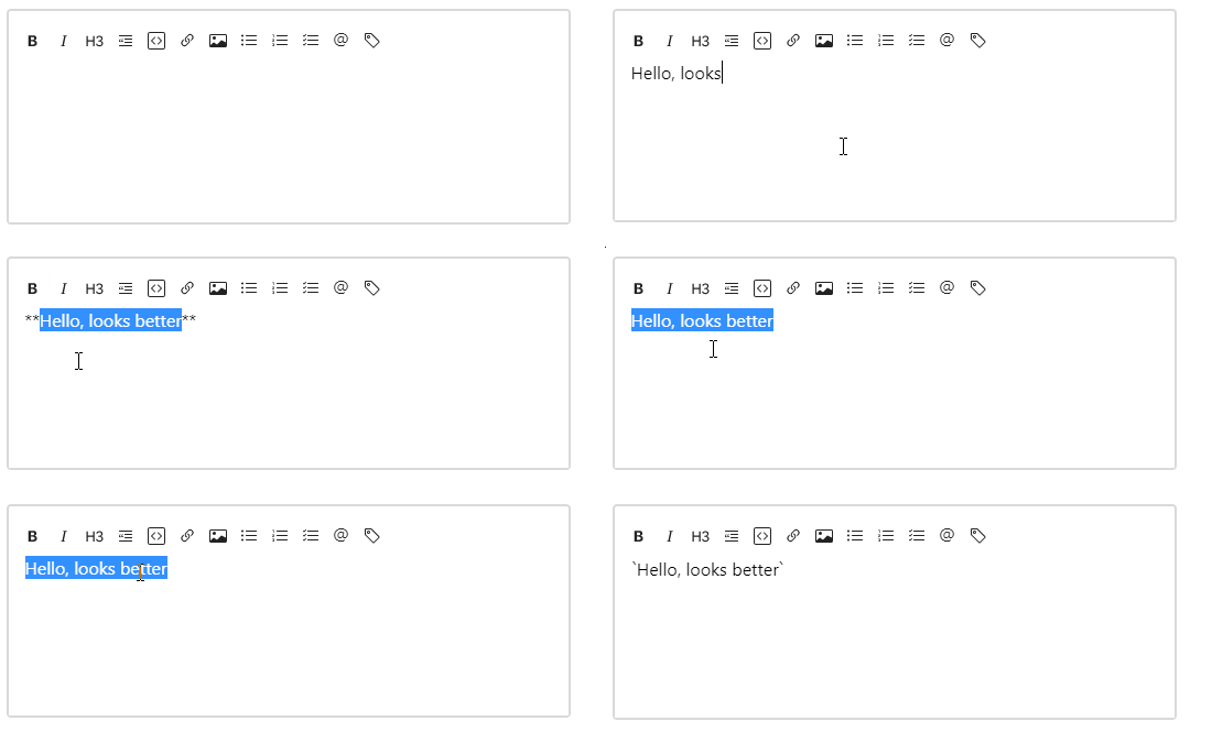
Why? Because we need to set an extra class to the parent of the textarea. We need to:
- Handle
focusevent of the textarea to add a class named.focusto the parent container. - Also, handle
blurevent to remove this class from the parent container.
I also added cdkTextareaAutosize from @angular/cdk/text-field package to make the textarea auto-expand its height when the content is too long. By default, textarea will have a scrollbar visible and won’t auto-expand. See more on my previous tutorial - Build an editable textbox. I also set the cdkAutosizeMinRows to 6 so that it will also have a certain minimum height.
<textarea class="text-editor"
          (focus)="focus()"
          (blur)="blur()"
          [formControl]="control"
          id="MarkdownInput"
          cdkTextareaAutosize
          [cdkAutosizeMinRows]="6">
</textarea>
export class MarkdownEditorComponent implements OnInit {
@HostBinding('class.focus') isFocus: boolean;
focus() {
this.isFocus = true;
}
blur() {
this.isFocus = false;
}
}What the HostBinding does is check if isFocus is true, then Angular will add a class name focus to the component selector. It look like <markdown-editor class="focus. If the value is false, then remove this class then.
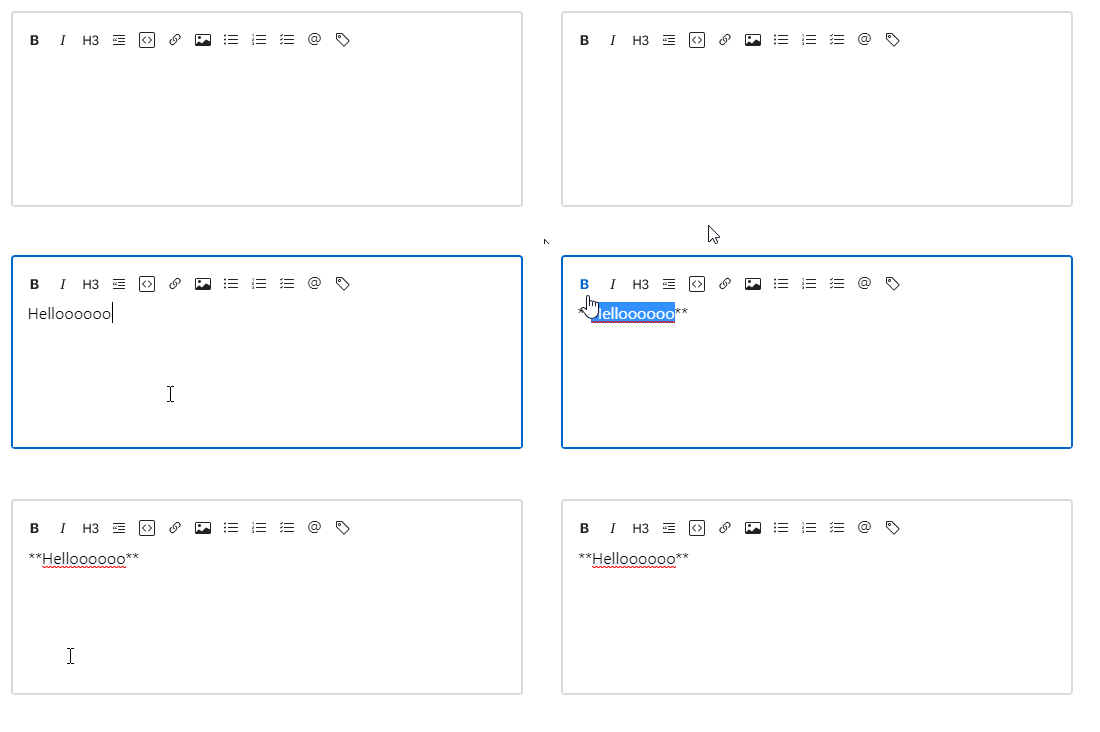
I think we are almost there, looks excellent now. The last thing is to connect this component with a form.
Link the markdown editor component to a form
Usually, the Markdown editor will be used in a form with some additional form input, and you wanted to see its value in the form instance.
To do it, simply set the MarkdownEditorComponent to accept an input, which is a FormControl so that the control can be passed into the component from the parent component form instance.
The component will initial a default FormControl if there is no input passed.
export class MarkdownEditorComponent implements OnInit {
  @Input() control: FormControl;
  ngOnInit(): void {
    this.control = this.control ?? new FormControl();
  }
}
And bind the control to the component HTML
<textarea id="textarea_id"
          class="text-editor"
          [formControl]="control"
          (focus)="focus()"
          (blur)="blur()"
          cdkTextareaAutosize
          [cdkAutosizeMinRows]="6">
</textarea>
To be able to do that, you have to import ReactiveFormsModule into MarkdownEditorModule
@NgModule({
  imports: [
    CommonModule,
    ReactiveFormsModule
  ],
  //code removed for brevity
})
export class MarkdownEditorModule { }
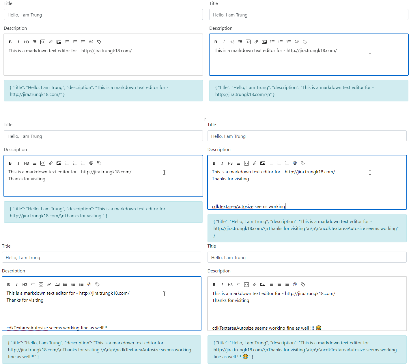
To test it with a form, I will create a simple form with two inputs by FormBuilder:
- Title as the normal textbox
- Description as the markdown editor
export class AppComponent implements OnInit {
  form: FormGroup;
  constructor(private _fb: FormBuilder) {}

  ngOnInit() {
    this.form = this._fb.group({
      title: ["Hello, I am Trung", Validators.required],
      description: ["This is a markdown text editor for - http://jira.trungk18.com/"]
    });
  }

  get descriptionControl(){
    return this.form.controls.description as FormControl
  }
}
I also get the description control from my form and then send it to the MarkdownEditorComponent
<form [formGroup]="form">
  <div class="form-group">
    <label for="Title">Title</label>
    <input formControlName="title" class="form-control" id="Title" aria-describedby="Title">
  </div>
  <div class="form-group">
    <label>Description</label>
    <markdown-editor [control]="descriptionControl"></markdown-editor>
  </div>
</form>
<div class="alert alert-info">
  {{ form.value | json }}
</div>
Sweet, everything seems working as expected.
Accessibility
Last but not least, remember to add the aria-label and title for all of the icons. Otherwise, If users are not familiar with the text edit icon, they might find it difficult to understand the meaning. The aria-label is for people with disability can have an easy navigation through your website :)
<markdown-toolbar for="textarea_id">
  <md-bold>
    <button class="btn" title="Bold" aria-label="Bold">
    <svg width="1em"
          height="1em"
          viewBox="0 0 16 16"
          class="bi bi-type-bold"
          fill="currentColor"
          xmlns="http://www.w3.org/2000/svg">
        <path d="M8.21 13c2.106 0 3.412-1.087 3.412-2.823 0-1.306-.984-2.283-2.324-2.386v-.055a2.176 2.176 0 0 0 1.852-2.14c0-1.51-1.162-2.46-3.014-2.46H3.843V13H8.21zM5.908 4.674h1.696c.963 0 1.517.451 1.517 1.244 0 .834-.629 1.32-1.73 1.32H5.908V4.673zm0 6.788V8.598h1.73c1.217 0 1.88.492 1.88 1.415 0 .943-.643 1.449-1.832 1.449H5.907z" />
    </svg></button>
  </md-bold>
  <!-- code removed for brevity -->
</markdown-toolbar>
Now when you hover over the icon for sometimes, the browser will display the title.

That’s all for building a Markdown Editor with Angular. Any questions, you can leave it in the comment box below or reach me on Twitter. Thanks for stopping by!
