Wanna see something cool? Check out Angular Spotify 🎧
Angular Jira Clone Part 08 - Create placeholder loading (like Facebook's cards loading)
It is common to display a loading spinner to keep visitors entertained while the page is still loading. And there are two modes of a loading spinner:
| Mode | Description |
|---|---|
| determinate | Standard progress indicator fills from 0% to 100% |
| indeterminate | Indicates that something is happening without conveying discrete progress |
Spinners and progress bars are explicit loading paradigms. They focus the user on communicating a loading period and, more often than not, are blocking user interaction until a layout has loaded enough to be useful.
No one wants to wait 🤣
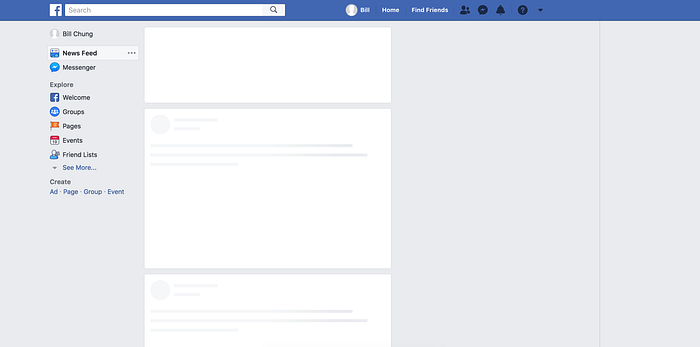
Introducing placeholder loading, it is usually grey or neutral-toned filled shapes, meet the user instantly upon user interaction with calls to action or links. The placeholders (the so-called “bones” of the skeleton) are then replaced with the actual site content, and the illusion is complete. That’s what skeleton screens do: create the illusion of an instant transition.
A famous example is Facebook’ newsfeed.
Based on a research, displaying a skeleton screen will cause humans to perceive a loading period as being shorter in duration
Jira clone placeholder loading
On jira.trungk18.com, I also need a placeholder loading for an issue detail. I could display a spinner, but too much spinner doesn’t seem like an excellent way to interact with your user. 😂
The standard-issue detail will have two columns layout.
 in Angular")
I translated the above detail layout to gray rect and circle SVG at the end.

How to create a placeholder loading
I used ngneat/content-loader for this purpose. You need to prepare an SVG structure, and content-loader will do the rest of the work for you, including the animation.
Install
yarn add @ngneat/content-loaderUsage
import { ContentLoaderModule } from '@ngneat/content-loader'

@NgModule({
  imports: [ContentLoaderModule],
})
export class AppModule {}
And specify your placeholder template:
<content-loader>
  <svg:rect x="0" y="0" rx="3" ry="3" width="250" height="10" />
  <svg:rect x="20" y="20" rx="3" ry="3" width="220" height="10" />
  <svg:rect x="20" y="40" rx="3" ry="3" width="170" height="10" />
  <svg:rect x="0" y="60" rx="3" ry="3" width="250" height="10" />
  <svg:rect x="20" y="80" rx="3" ry="3" width="200" height="10" />
  <svg:rect x="20" y="100" rx="3" ry="3" width="80" height="10" />
</content-loader>
Warning: Safari renders the SVG in black in case your Angular application uses the
<base href="/"/>tag in the<head/>of yourindex.html. Refer to the input propertybaseUrlon the library documentation to fix this issue.
What is svg:rect
There are several basic shapes used for most SVG drawing. SVG has some predefined shape elements that can be used by developers:
- Rectangle
<rect> - Circle
<circle> - Ellipse
<ellipse> - Line
<line> - Polyline
<polyline> - Polygon
<polygon> - Path
<path>
For placeholder loading, the most used two are rect and circle.
For Angular to work, you need to specify
svg:rectinstead of purelyrect. If you userectonly, it will give you an error
Explanation
In detail for rect, it is a basic SVG shape that draws rectangles, defined by their position, width, and height. The rectangles may have their corners rounded.
<svg:rect x="20" y="100" rx="3" ry="3" width="80" height="10" />| Attribute | Description | Explain |
|---|---|---|
| x | left position of the rectangle | x="20" places the rectangle 20px from the left margin |
| y | top position of the rectangle | y="100" places the rectangle 100px from the top margin |
| width & height | height and the width of the rectangle | width="80" mean 80px wide and height="10" mean 10px tall |
| rx | radius on the x-axis (horizontal corner) |
rx="3" mean 3px radius on the x-axis |
| ry | radius on the y-axis (vertical corner) |
ry="3" mean 3px radius on the y-axis |
How to create Jira clone placeholder loading
Pretty straight forward, based on the issue detail layout with two columns. I went ahead and wrote the following code. You’re all set!
<content-loader
  [viewBox]="'0 0 940 260'"
  [backgroundColor]="'#f3f3f3'"
  [foregroundColor]="'#ecebeb'"
>
  <svg:rect x="0" y="0" rx="3" ry="3" width="627" height="24" />
  <svg:rect x="0" y="29" rx="3" ry="3" width="506" height="24" />
  <svg:rect x="0" y="77" rx="3" ry="3" width="590" height="16" />
  <svg:rect x="0" y="100" rx="3" ry="3" width="627" height="16" />
  <svg:rect x="0" y="123" rx="3" ry="3" width="480" height="16" />
  <svg:rect x="0" y="187" rx="3" ry="3" width="370" height="16" />
  <svg:circle cx="18" cy="239" r="18" />
  <svg:rect x="46" y="217" rx="3" ry="3" width="548" height="42" />
  <svg:rect x="683" y="3" rx="3" ry="3" width="135" height="14" />
  <svg:rect x="683" y="33" rx="3" ry="3" width="251" height="24" />
  <svg:rect x="683" y="90" rx="3" ry="3" width="135" height="14" />
  <svg:rect x="683" y="120" rx="3" ry="3" width="251" height="24" />
  <svg:rect x="683" y="177" rx="3" ry="3" width="135" height="14" />
  <svg:rect x="683" y="207" rx="3" ry="3" width="251" height="24" />
</content-loader>
Source code and demo
See all tutorials for Jira clone
References
Published 7 Nov 2020