The different between :focus and :focus-visible
Problem
Browsing the web using different input methods like a mouse, keyboard, or assistive technology devices requires clear indicators of the current interactive element for a good user experience and accessibility. While default browser stylesheets do a great job, there are cases where we may want more control over focus styling.

One common argument against focus indicators is that they appear even when you click on a component with a mouse or tap on it. Designers and stakeholders often don’t prefer this behavior.
Currently, modern browsers only show default focus indicators when necessary, specifically when navigating with a keyboard. The focus outline doesn’t show up when an element is clicked or tapped; it only appears when tabbing to it using a keyboard.
Understanding the Issue
In the provided code and example:
&:hover {
  background: red;
  color: white;
}

&:focus {
  outline-color: #007dbc60;
  outline-offset: 0.5rem;
  transform: scale(1.5);
}
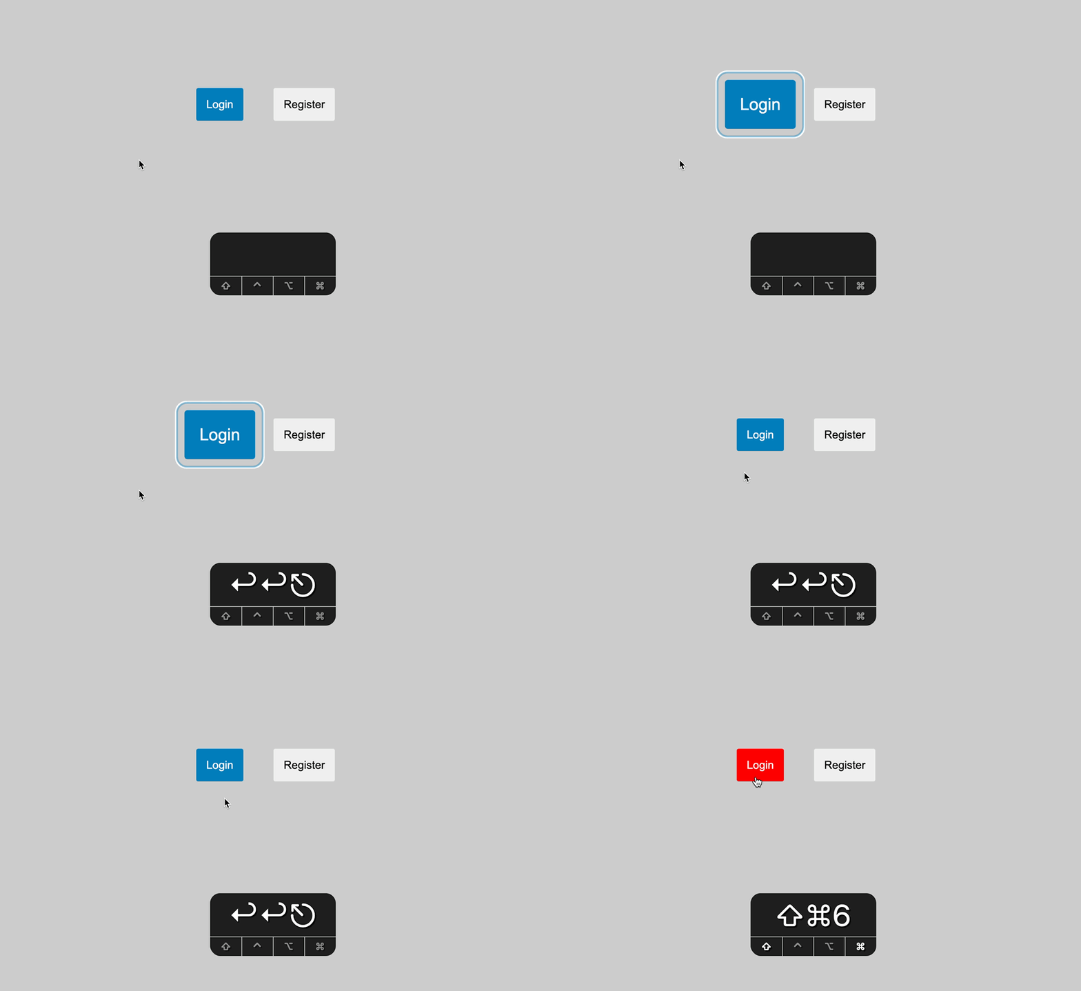
We applied a different outline color and a transform(1.5) to the element to make the focus state visually obvious.
The problem arises when:
- Navigating with the keyboard, both the
outlineand the element grow bigger withtransform. - Clicking with the mouse, the
outlineis invisible, but the element still grows bigger withtransform. This behavior is not desired.

Somehow, when we click, it also captures the focus state.
You may wonder why only the scale is applied, but not the outline.
The reason is that the outline is a property that is only visible when the element is focused using focus-visible under the hood. So, when we click, the outline is not visible, but the scale is still applied.
To solve this issue and show focus indicators only for users who need them, we can use the :focus-visible selector.
What is :focus-visible?
:focus-visible works just like :focus, but it only applies focus indicator styles to an element when it receives keyboard focus.
Now, the focus indicator will only be visible to users navigating with a keyboard or keyboard-like assistive technology. Users who aren’t using a keyboard won’t even know it’s there!
To fix the issue above, simply change :focus to :focus-visible in our CSS:
- &:focus {
+ &:focus-visible {
  outline-color: #007dbc60;
  outline-offset: 0.5rem;
  transform: scale(1.5);
}
Browser Support
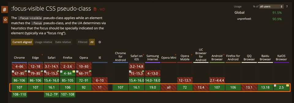
The :focus-visible pseudo-class is supported by all major browsers except for IE11.

Support notes — March 2023
The :focus-visible pseudo-class is now supported in all major browsers.
But we recommend that default :focus styles are still provided, as a fallback for older versions, since focus indication is so critical.
Read more for more details and an alternative :focus:not(:focus-visible)
Key Takeaways
If you want to display focus indicators only for keyboard users, utilize the :focus-visible pseudo-class instead of :focus.