Wanna see something cool? Check out Angular Spotify 🎧
Angular Jira Clone Part 02 - Build the application layout with flex and TailwindCSS
My second tutorial for jira.trungk18.com will walk you through how to build the application layout that has navigation, sidebar and content.
See all tutorials for Jira clone
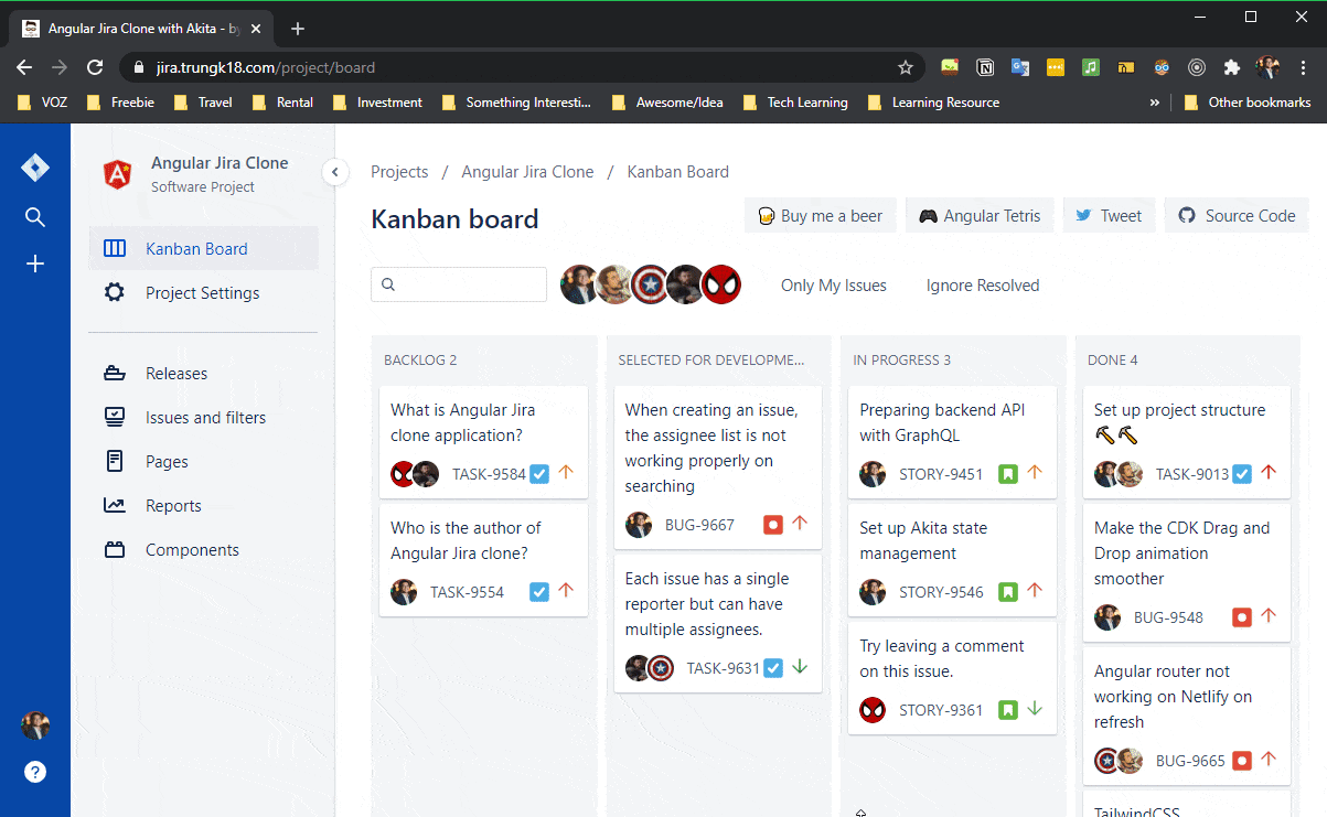
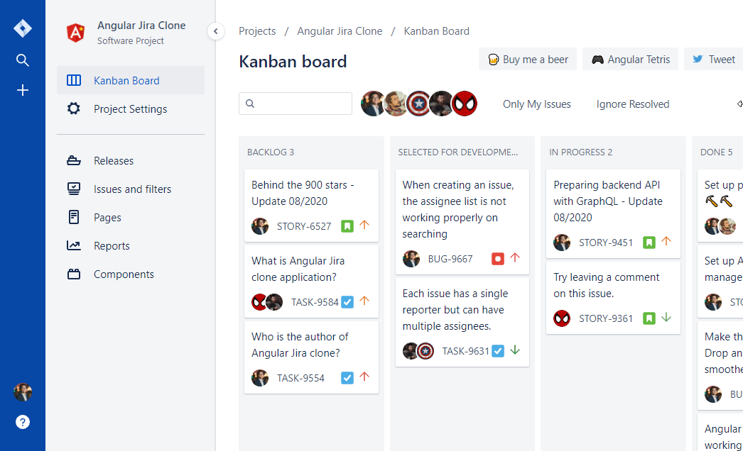
Navigation Section
If you look at the final application, you will see that there are:
- A left navigation bar to display the logo and some icons on top, with user profile and about icon at the bottom
- A sidebar next to the navigation bar that will be collapsible that display some navigation on the application
- A resizer that can toggle the sidebar collapsible
- A content section to display either a drag and drop board or a form
I was visualizing them as three separate components and that is how the mockup looks like with three columns.

Because I only need to support one dimension layout, I choose to use flex for that purpose. In the most simple form, that is how the navigation component looks like.
<div class="navigation">
  <div class="flex flex-row overflow-hidden h-full">
    <app-navbar-left></app-navbar-left>
    <app-sidebar [expanded]="expanded"></app-sidebar>
  </div>
  <app-resizer (click)="toggle()" [expanded]="expanded"></app-resizer>
</div>
.navigation {
display: flex;
}1. Custom TailwindCSS
I need the left navigation to have 64px width and the sidebar 240px. I go ahead and modify the tailwind.config.js to have an additional two spacing needed.

By default the spacing scale is shared by the padding, margin, width, and height utilities so the above configuration would generate classes like .p-2, .mt-3, .w-5, .h-6 and my custom one w-sidebar and w-navbarLeft.
2. Build the left navigation
After configuring the custom spacing for Tailwind, I start to build up the left navigation component.
.navbarLeft-content {
  @apply h-screen w-navbarLeft pt-6 pb-5 flex flex-col bg-primary flex-shrink-0;
}

.logoLink {
  @apply relative pb-2 flex items-center justify-center;
}
That’s the simplified version of the left navigation HTML code. I have an aside that wrap a .navbarLeft-content class which I have some style defined above: set full height of the viewport (100vh), some margin, padding, and flex style.

To go into every single detail on CSS is difficult because It would make the blog post too long. You should be able to figure it out by yourself 💪💪💪
3. Sidebar
It is very similar to what I have done for the left navigation, still using flex. But It poses an interesting topic, scrollable content. Let see how it looks on the below screenshot
Basically, you wanted to have a y-scroll appear when there is not enough space. But it was tricky sometimes.
4. Scroll-able container with dynamic height using Flexbox
I found an excellent article How to make a scrollable container with dynamic height using Flexbox by @stephenbunch.
One of the hidden features of Flexbox is the ability to make a flex child scrollable. In the past, if you wanted to make a scrollable container, you had to give the container a predefined height. In other words, the height could not be based on the size of its surrounding content. You had to use pixels, percentages, or absolute positioning if you wanted an element’s content to scroll.
With Flexbox, we can now create scrollable containers whose size depends on the available space after the rest of the content has been laid out.
The key is to use Flexbox for all containers that wrap the scrollable container and give the outermost container a predefined height. Since content lays vertically on the page by default, I recommend making each container use the vertical (column) flex layout rather than the default horizontal (row) layout.
See the example below for how it should look.
That was what I have done for the layout, I started making the container display at the very top body level down to app-component and way below until I reached to the scrollable container.

5. Resizer
I have a dumb resizer component to have only an Input to toggle the arrow display.
export class ResizerComponent implements OnInit {
  @Input() expanded: boolean

  get icon() {
    return this.expanded ? 'chevron-left' : 'chevron-right'
  }
  constructor() {}

  ngOnInit(): void {}
}
I also use window.matchMedia to automatically collapse the sidebar when the screen size is less than 1024px.
handleResize() {
  const match = window.matchMedia('(min-width: 1024px)');
  match.addEventListener('change', (e) => {
    console.log(e)
    this.expanded = e.matches;
  });
}
Wrap up the navigation and content
After finishing the navigation component, I plugged it into the project page layout.
<div class="w-full h-full flex">
  <app-navigation
    [expanded]="expanded"
    (manualToggle)="manualToggle()"
  ></app-navigation>
  <div id="content">
    <router-outlet></router-outlet>
  </div>
</div>
<svg-definitions></svg-definitions>
And I started to define the route for ProjectModule. All is set up!
const routes: Routes = [
  {
    path: '',
    component: ProjectComponent,
    children: [
      {
        path: 'board',
        component: BoardComponent,
      },
      {
        path: 'settings',
        component: SettingsComponent,
      },
      {
        path: `issue/:${ProjectConst.IssueId}`,
        component: FullIssueDetailComponent,
      },
      {
        path: '',
        redirectTo: 'board',
        pathMatch: 'full',
      },
    ],
  },
]
Published 27 Aug 2020